Jenny Wu
UX Designer
Digital artist
Simplifying the setup flow for smart home security products
Alarm.com
Security & Home Automation


The camera installation process is a key experience a user has when they onboard with Alarm.com. It is required for setting up an account & accessing the dashboard, & it has multiple confusing, non-intuitive steps that frequently confuse customers. As a developer with a UX team that was spread very thin, I took matters into my own hands to improve this experience.
Goals
-
Gain experience in UX design & Figma with a real product & problem
-
Improve the overall usability of a critical user flow
-
Present my designs to the UX team for learning & potential implementation
-
Expand the team's existing iOS design system to include Android-friendly components
Activities
-
User Flow Analysis
-
Heuristic Evaluation & UX Audit
-
Wireframe Ideation
-
Iterative Design
-
Component Library Creation

Gathering Data
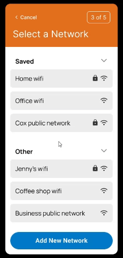
User Flow Diagram
The user flow diagram helped me not only understand the user’s needs & points of interaction, but also identify shortcomings in the existing UI. In the example below, I visualized the decision-making involved in choosing a WiFi network to connect the installing camera to.
Some areas for improvement I immediately identified were:
-
The easiest option for the user (using a saved network) is not the most emphasized
-
The terminology used on the screen doesn't match what users are most familiar with
-
Too much empty, un-utilized space
-
Non-intuitive layouts & components
-
Lack of user feedback, like when the system is loading or the process is complete
-
Lack of personality, screens appear overly technical with little to no help
.png)
Heuristic Evaluation and Audit
After looking at the user flow, I went back to the existing designs to further identify any deficiencies. Using both NNG’s Usability Heuristics and Gestalt Design Principles to guide my analysis, I made notes summarizing any deficiencies I observed.

For each design problem I identified, I brainstormed straightforward solutions for each, for instance:
Problem: Poor user feedback

Solution: Increased user state visibility


DESIGN EXPLORATION
Wireframes
I started with sketching wireframes to draft out solutions, focusing more on quantity over quality so I could produce as many designs as possible.

Drafts and More
Then, armed with a plethora of messy drafts & clearer design goals, I transitioned my work over to Figma. Over many iterations, I experimented with different colors, text styles & sizes, button arrangements, & more. I even referenced similar screens on other market apps for some visual inspiration.

Final Designs
The final designs I settled on emphasized simplicity & visibility of state. I wanted to make sure users were always aware of where they were & what actions they had to take. I also wanted to make sure the UI was accessible, understandable, & clean. Below is a prototype showcasing some of the redesigned screens!
Design System
In the process of iterating, I also started defining my own design system. I found the component properties particularly useful for making functional variations or quickly switching between styles.

Outcomes
During my first round of prototyping, I presented some of my designs to the lead designer at my company, who was kind enough to take some time & provide me with feedback. It was a very mutually beneficial exchange, as I was able to learn the style of the company’s designers, & the designers took inspiration from my designs & included those elements in their new designs. These designs are currently being implemented in our newest feature, which should go live in August 2024!
Learnings
Prioritizing clarity over efficiency. While it can be good to build things for efficiency & functionality, as engineers usually do, the resulting product can be confusing from a user perspective. Evaluating the UI for what a typical user would find challenging helped me restructure my thinking towards helping the user out as much as possible, minimizing errors & guiding them through whatever they need to do!
Following the user's journey. Diagramming & deconstructing the user process was invaluable for considering users' needs. The exercises taught empathy & understanding.
Design system. Spending time to define a design system helped speed up the design process & improve consistency. Once I had the elements, I was able to use them like building blocks for each page.