Jenny Wu
UX Designer
Digital artist
Designing a minimalistic, customizable spending tracker
Personal Project


Budgeting is often viewed as a daunting, repetitive, & un-fun chore. Many of my friends & family, as well as myself, have struggled to find a reliable, engaging, & consistent way to keep track of budgets. There are major pain points in existing financial tools that I wanted to improve upon, so I chose to design & create my own mobile application focused on easy & customizable budgeting.
Goals
-
Create an application from scratch to fill a personal need
-
Gain experience in the application design process from start to finish
-
Improve upon design issues & deficiencies found in existing apps with similar functionality
Activities
-
User interviews & persona creation
- Brainstorming, sketching, & wire-framing
-
Prototyping
-
Design system definition
USER INTERVIEWS & PERSONAS
My interviewees consisted of several of my peers who have a range of budgeting experience & financial situations, i.e. a married couple with a toddler, a recent college graduate employed in tech, a minimum age worker, & more.
Some reoccurring themes I discovered were:
-
Not everyone budgets because they have larger financial goals!
-
Existing budgeting apps don't do a good job of keeping user engagement.
-
Manually tracking spending takes too long & is discouraging/hard to keep up with.
-
Positive reinforcement encourages users to stick to the budget plan.


I also created user personas to help me better envision & describe the user base I'm targeting. I strove to represent a variety of financial situations & goals.
THE CREATIVE PROCESS
Focusing on what I learned from the user interviews & personas, I started creating designs (to be used later for testing & gathering feedback).
Sketches and Wireframes
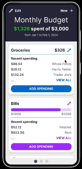
I initially brainstormed ways to present spending information in an easily digestible format. I also sketched out some other basic budgeting app functionality such as:
-
Logging money spent or earned
-
Categorizing/organizing spending
-
Setting budgeting goals
-
Summarizing overall spending
-
Editing spending amounts

I refined my favorite ideas into cleaner wireframes, putting more effort into defining more clearly structured layouts. I practiced using layout grids in Figma to better space elements out.


Once I settled on a layout design, I created a preliminary design system with font styles, buttons, cards, & more.


TESTING AND ITERATION
In order to ensure the app addressed all the needs & issues of my interviewees, I asked some of them to help me test my designs & provide honest feedback.
User Flow Testing
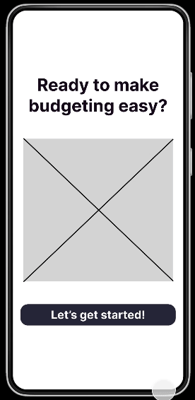
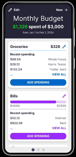
Using my prototypes (examples below), I had users mimic performing different tasks that would take them through the app's flow. As they walked me through their actions, I made notes of where they succeeded, struggled, & asked questions. I avoided guiding them or interfering with their thinking to get as close to a "first time interaction" as possible.
Design Review
I also presented these initial designs to some more experienced designers for feedback. They identified a few areas for general improvement, such as:
-
Better color contrast (using plugins like Stark)
-
More spacing (decrease content density for users)
-
Larger interactive elements (better usability)
Outcomes
With all the work done so far, I have a detailed prototype that I can continue testing & gathering feedback with. And with every conversation, I gain more confidence that my app will meet my users' needs & provide a good experience!
Learnings
User interviewing. From the initial user interviews to the first round of prototype testing & feedback, I learned a lot about how much research goes into thoroughly understanding users' needs. There are so many new perspectives, situations, & preferences that I've learned about.
User flow testing. I learned the importance of allowing users to have an unbiased, independent experience of the app during testing, as this mimics how users would interact with the application for the first time, on their own. This process gave me valuable insight into which parts of my designs were confusing & difficult vs. intuitive & easy to navigate.
Next Steps
There's still a lot more work to do before I start development work on this app. I intend to iterate through my designs many more times, clean up the UX experience more, & continue following the Double Diamond process model to create as fun, simplified, & versatile of a budgeting experience as I can. As this personal project progresses, I will continue to add updates to this page!